Logo

Main logo
Basic logo is being used in publications, presentations, e-mail footers and all other media.

Baseline logo
The baseline logo is an expanded version of the main logo. It is suitable for bigger scale designs (banners, posters, title pages, etc.)
Reduced logo
Reduced logo is being used in all publications which are requiring a small ratio (i.e. Powerpoint footer).

Logo use on dark backgrounds
Logo use on light backgrounds
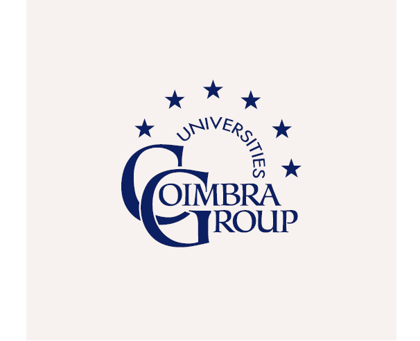
Logo use on photos
To maintain the legibility of the logo, it is recommended to cover the photo with a solid
black layer, set to 20% opacity.
Always make sure that the background is not overly
busy and does not obstruct the logo.
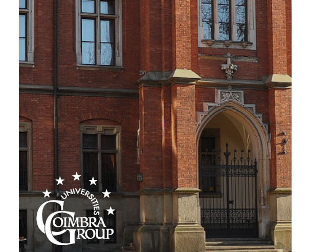
Safe space
To achieve best readability, always leave enough space around the logo.
The safe space of the logo is based on the size of the letter “o”.
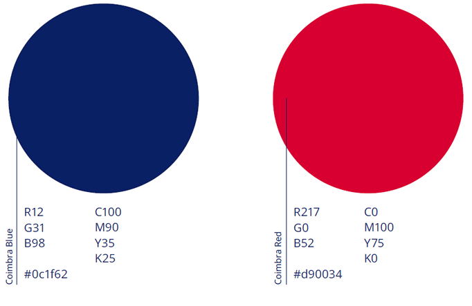
Colors
Main colours
Use these colours for all digital & print media.
Secondary colours
Use these colours for all digital & print media.

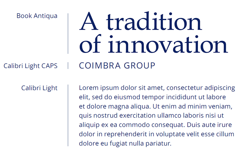
Typography
Main typefaces
Coimbra Group uses Book Antiqua and Calibri as their main typefaces.
Always use Book Antiqua for the titles, and Calibri for the body text and subtitles, according to the type of project.
Standard document settings
To maintain consistency of typography, it is recommended to use the following settings.